
From Tourist Anxiety to Local Confidence
Hello Local is a travel support ecosystem designed to bridge the gap between "tourist" and "local" by demystifying cultural nuances and essential logistics.
Role
UX Reseacher
UI Designer
Graphic Designer
Team
1 UX Researcher
1 Motion Designer and
Graphic Designer
Timeline
3 months (prototype)
August 2025- Oct 2025

About Give5
How did it start?
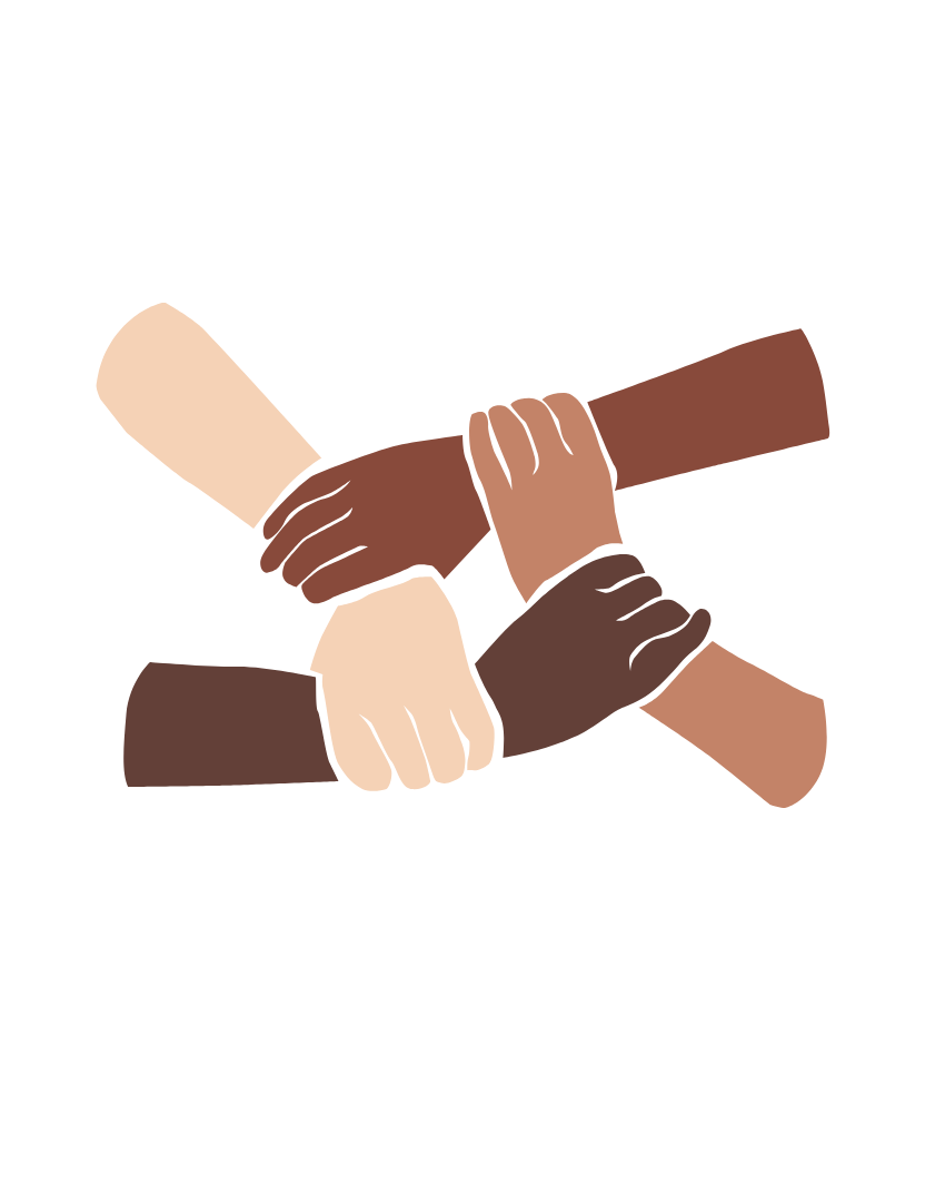
2 Girls from India
Inspired by two colleagues’ transition from India to the US, Hello Local addresses the gap between merely existing in a new country and becoming a local. They identified a dual-level struggle: surface-level survival versus deep cultural integration. To solve this, we designed a transition tool for newcomers. I joined to explore how technology bridges diverse walks of life, synthesizing research and design-thinking to produce a cohesive cultural guide .
who is it for?
Primary Stakeholders
- Solo and Group internation travelers.
- Expat families.
- Denver Residents, Volunteer Coordinators, Community Activists.
Ecosystem Stakeholders
- Local Municipalities & Tourism Boards
- Emergency Service Providers
- Cultural Content Experts
hypothesis
Newcomer pain points
Safety

Navigating unfamiliar emergency protocols creates significant vulnerability. Without direct access to localized police or medical resources, newcomers face heightened risk. This lack of a dedicated safety infrastructure and real-time location sharing remains a critical barrier during high-stress transitions.
cultural
belonging
Beyond surface-level survival, "invisible" social norms dictate true integration. Newcomers often struggle with cultural friction and unspoken etiquette, feeling like outsiders. Bridging this gap requires synthesizing these latent nuances into accessible guidance to foster a genuine sense of belonging.
transportation
Fragmented transit systems and unfamiliar logistical patterns often lead to information paralysis. Understanding how to choose, pay for, and navigate local transport is a major hurdle. Simplifying these complex systems is essential for empowering travelers to move with confidence.
Research and Design Objectives

Create a way for the most important information and etiquette rules about a place to be displayed in a centralized manner that is easy to digest and relevant to both the location and the user.
Create a transportation flow that acts as a maps and transportation intermediary while assisting people in traveling about an unfamiliar city through progressive disclosure and guided navigation.

Create an app that is warm and friendly, a UI experience that automatically makes the user feel welcome and inspired to learn different nuanced things about going to another culture.

Create a streamlined emergency flow that minimizes steps for contacting organizations, ensures help is one tap away, and distills the different types of emergency services for high-stakes moments.
Research
methodologies
Identifying barriers to traveler cultural autonomy.
To understand the challenges of adapting to a new country, we conducted a mix of surveys, interviews, and competitive analysis. This research isolates where cultural friction, etiquette gaps, and logistical confusion occur, allowing us to design targeted support for newcomers navigating unfamiliar environments.
Quantitative Surveying: Evaluated broad travel pain points to prioritize feature development and affirm hypothesis regarding emergency and culture shock experiences.
Qualitative Interviews: Conducted deep-dives into the lived experiences of immigrants and solo travelers to isolate specific moments of navigational dissonance.
Competitive Audit: Analyzed existing market solutions to identify gaps in localized emergency response and "invisible" etiquette guidance.
survey - google form
Tell us about your experience traveling
We distributed a Google Form survey shared across tourist and travel Reddit groups that garnered 33 responses covering general travel habits, group dynamics, and closed-ended questions regarding specific travel issues. Of these respondents, 26 had traveled before, allowing them to provide relevant insights based on their recent experiences to help us identify common navigational and cultural hurdles.
Results summary:
1
Most people travel with family for just a few days.
2
Most people who have traveled have faced emergency situations during their stay.
3
Most people who traveled have experienced culture shock in some fashion.
.png)
user interviews
Share the deeper story behind your journey
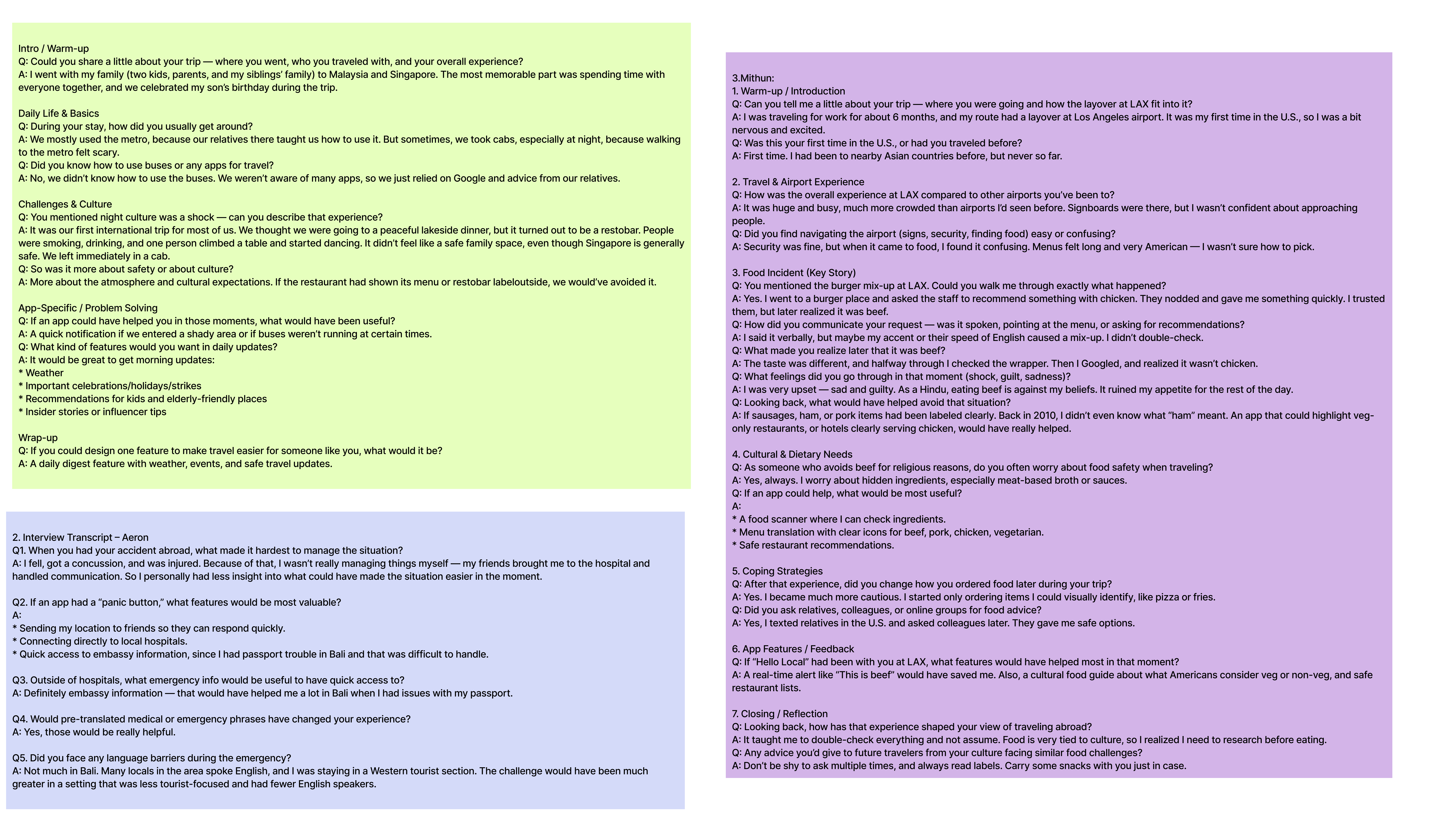
We conducted personal interviews with 3 participants selected from the Google Form responses. This allowed us to dive deeper into their lived experiences, cultural challenges, and specific pain points that quantitative surveys alone couldn’t capture. We tailored interview questions to their specific survey responses.
interviews
Interview takeaways
user 1
Navigation Dependency: Relied entirely on relatives for guidance and transit.
Safety Concerns: Reported significant fear of walking alone at night.
Digital Literacy Gap: Lacked knowledge of local transit systems or essential apps.
Environmental Dissonance: Experienced culture shock from nightlife due to unclear venue labeling.
User Needs: Requested family-friendly guidance and a proactive safety infrastructure.
Desired Features: Prioritized a morning briefing and real-time safety alerts.
user 2
Menu Dissonance: Experienced significant confusion when navigating foreign-language menus.
Dietary Miscommunication: Improper translations led to the accidental consumption of restricted foods.
Support Gap: Found current tools lacked adequate support for specific dietary restrictions.
Visual Requirements: Identified a need for clear universal icons (e.g., meat vs. vegetarian).
Safety Features: Requested an integrated ingredient checker to verify local food components.
Curated Recommendations: Prioritized access to a verified list of "safe" local restaurants.
user 3
Critical Navigation Failure: Emergency conditions rendered standard self-navigation impossible.
Immediate Access Needs: Required instantaneous access to local hospitals and embassy contacts.
Security Requirements: Identified a high-priority need for an integrated "Panic Button."
Logistical Support: Suggested real-time location sharing to assist emergency responders.
Communication Barriers: Highlighted a lack of pre-translated emergency phrases for medical staff.
Support Infrastructure: Prioritized consolidating various emergency services into a single-tap interface.
interviews
Affinity mapping to identify patterns
To synthesize our research, we conducted affinity mapping to categorize the raw data from the 3 in-depth interviews. This process allowed us to cluster recurring traveler frustrations into distinct themes, revealing the most critical pain points and highly requested features.
.png)
interviews
Themes from Affinity Maps

How do you figure things out?
Google, friends and family, and locals.

Emergencies
Problems getting to or accessing hospitals and emergency services.

Food related issues
Sickness due to food health or unknown ingredients.

Language Barriers
Difficulties arised due to language barriers.

Safety Concerns
During transporation, night-life, and in unfamiliar areas travelers questioned their overall safety the most.
competitive analysis
features gaps and opportunities
To identify white space in the travel market, we audited five leading navigation and local discovery apps: AroundMe, Spotted by Locals, Citymapper, Welcome App NL, and FindHello. This analysis revealed where existing tools offer logistical utility but fail to provide deep cultural clarity, integrated safety infrastructure, or specialized newcomer support. By mapping these functional gaps, we defined the essential features Hello Local must include to better serve the unique needs of international travelers and immigrants.
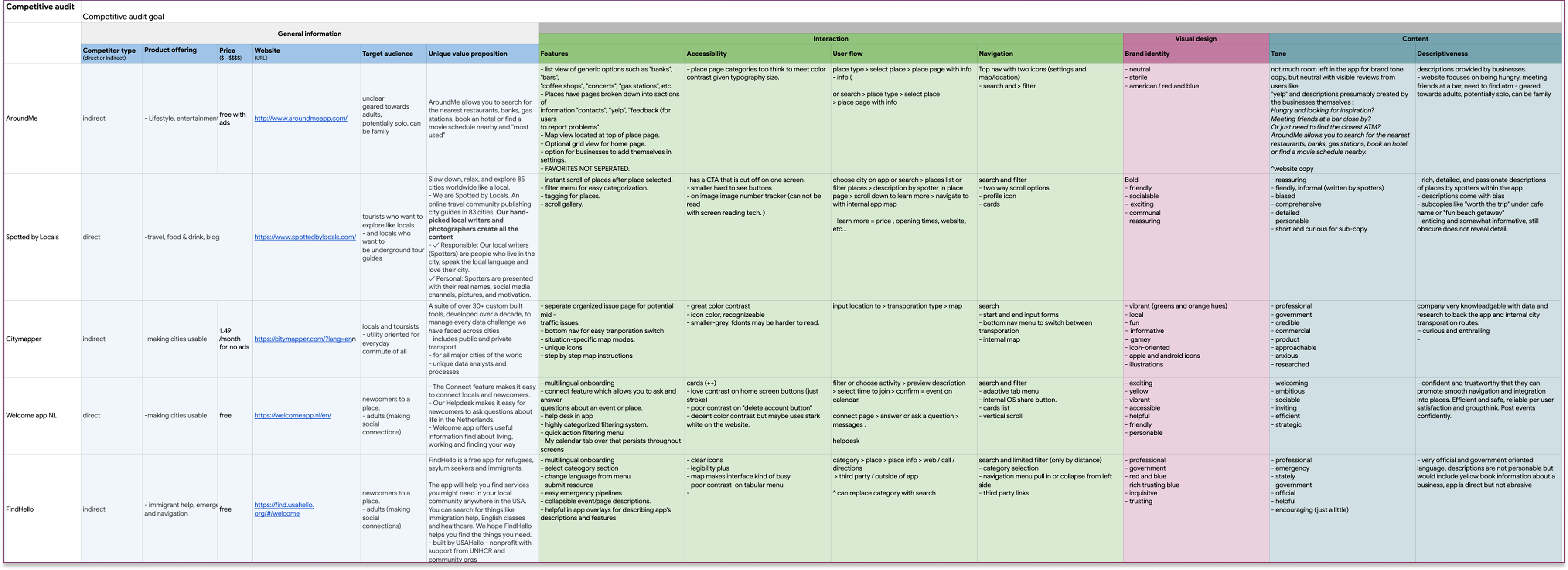
competitive audit
Gaps & Opportunities
Cultural & Etiquette Literacy
No audited apps provided dedicated sections for social nuances, such as local dining habits, tipping etiquette, or conversational norms, leaving users to navigate social friction alone.
Guided Transit Autonomy
There is a significant lack of instructional support for navigating local payment methods, boarding procedures, or system-specific logic, which are the primary drivers of traveler anxiety.
Streamlined Emergency Infrastructure
Only one app offered an emergency pipeline. Even then, the process was not streamlined for high-stress situations, missing critical "one-tap" functionality for contacting local services, embassies, or sharing real-time coordinates with responders.
user flow
Transforming Research into a user journey
.png)
visual design
Aesthetics
A Warm and Welcoming UI
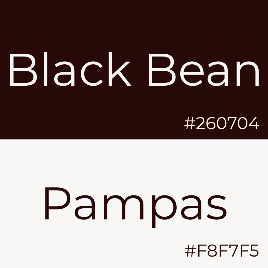
Color palette
Inspired by the atmosphere of a local coffee shop, the Hello Local system replaces sterile neutrals with a grounded palette of dark brown and cream. This foundation is accented by horizon-inspired oranges and purples, designed to evoke the warmth and optimism of a sunrise.
.png)


Typography Duo
I implemented a high contrast typographic scale using Montserrat Alternates for headers. By leveraging its curvy and organic forms, I added a sense of personality while pairing it with Plus Jakarta Sans for body text to ensure geometric legibility.
.png)
Logo
To visually anchor the brand's identity, I crafted a custom logo featuring a capital "H" for "hello." The symbol is built from two stylized figures embracing, subtly communicating the message "hello visitor, you are welcomed here."


Experience design
Execution
Prototyping comfort
Leveraging Figma as the primary design environment, I architected the core visual language and interaction patterns for the platform. My role centered on defining and refining the user experience across three key user flows, ensuring each journey aligned with the brand's mission of fostering community and ease of use.
1
Loading Screen Animation
2
Onboarding Flow
3
Transporation Sequence
Execution
Loading Screen
1
Loading Screen Animation
I crafted a loading animation highlighting the logo construction. Two halves of the "H" enter from off screen, meeting in the middle to form the emblem. Upon meeting, a slight "wave" signals "hello" before they bounce into place and the name mark appears below.
Execution
Welcome Onboard
2
Onboarding Flow
To minimize friction, I designed a streamlined onboarding flow that captures essential data while establishing the brand's identity. This experience introduces the user to the "Hello Local" environment using a warm and welcoming aesthetic. Through strategic color theory and high-intent CTAs, the interface transitions users from "stranger" to "welcome guest" before they even reach the home screen.
Execution
Lumi-assisted transport
3
Transport Flow
The transport flow features an integrated map where users navigate between locations. Once a destination is selected, available transit methods are displayed with dropdown arrows that reveal detailed information for each option. Before beginning a trip, the Lumi floating action button provides an optional welcoming layer of guidance by highlighting key journey details such as cost, efficiency, and local etiquette.
what did we learn?
Collaborative Resilience
Working through miscommunications and clashing ideas strengthened our cross-functional communication. We learned that healthy friction, when managed with a shared goal, lead to more rigorous problem-solving and a more cohesive final experience.
Iterative Refinement
Every round of feedback was an opportunity to pressure-test our assumptions. This iterative process taught us that design is never "finished"—it is a continuous cycle of testing, learning, and refining to achieve a more polished and intuitive end-produc
Managing Project Scope & Ambiguity
Navigating a broad initial concept taught us the importance of defining MVP constraints early. We learned to prioritize core user needs over "feature creep," ensuring the final product remained focused and functional.
 Next Case Study